CASE STUDY
CHOICE HEALTH

THE PROBLEM
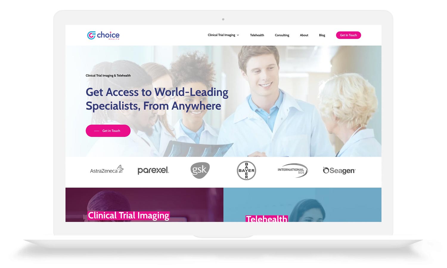
A clinical trial imaging company with impressive credentials and big clients struggled to present themselves with the look and sound of an industry-leader, making predictable growth difficult.
What We Did
Content Strategy
Copywriting
Visual Identity Design
Web Design & Development
The Team
Damian Vallelonga
Matt Carroll
AJ Roberts
The Industry
Healthcare

OUR SOLUTION
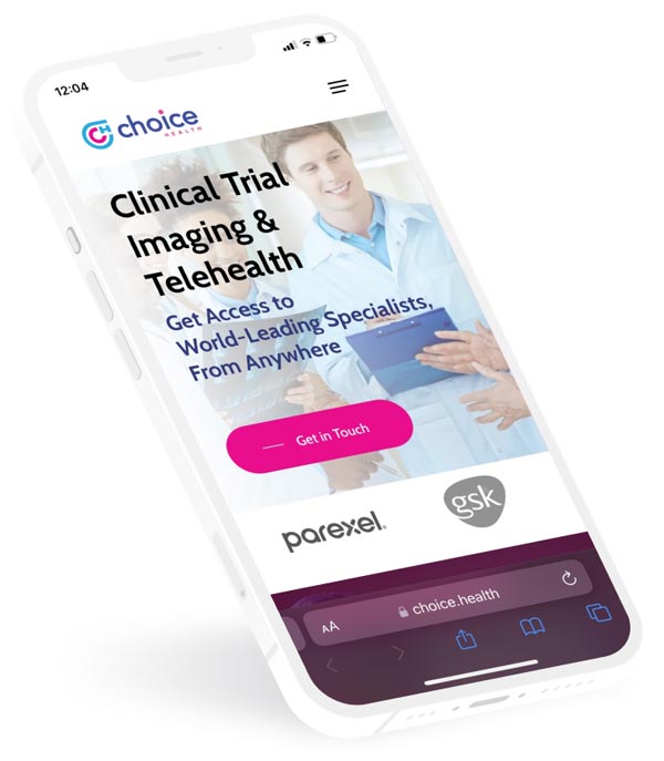
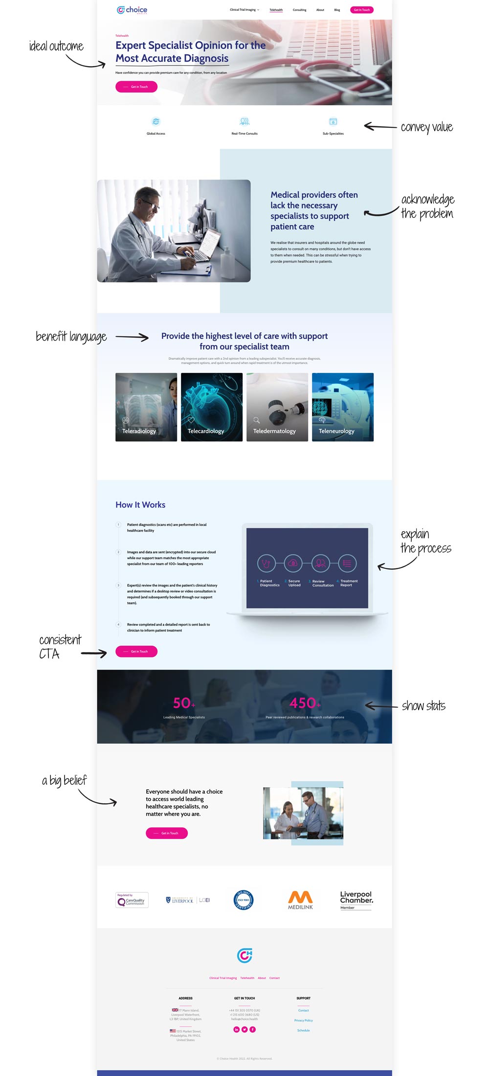
Start by rebranding the company with a fresh visual identity that helps establish them as a serious competitor in the industry. Next, develop brand messaging that gets at the heart of the problems and needs of their customers. Finally, design a website that both looks and sounds industry-leading. With clear and compelling language that tells the story of how Choice Health is able to transform their customers lives, they are now able to market themselves to the world with the professional appearance they always wanted.
THE BUILDING BLOCKS OF COMPELLING MESSAGING
TELEHEALTH LANDING PAGE


“When larger companies came to look at our previous website they were just put off by the appearance, which to them, said a lot about the company. Our new site often gets compliments, and we can compete with any of our big competitors as a front end shop window.”

Pauric Greenan
CEO, Choice Health
