CASE STUDY
SYRACUSE-ONONDAGA FOOD SYSTEMS ALLIANCE

THE PROBLEM
A brand new food advocacy nonprofit was forming and didn’t have a clear strategy to communicate their value to the community. The original drafted messaging was highly technical and lacked a compelling storyline to draw people in and compel them to support a new organization doing important work.
What We Did
Content Strategy
Copywriting
Visual Identity Design
Web Design & Development
The Team
Damian Vallelonga
The Industry
Nonprofit

OUR SOLUTION
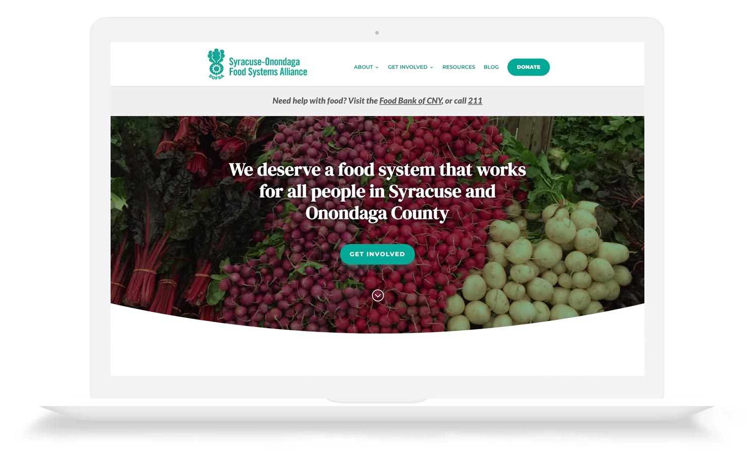
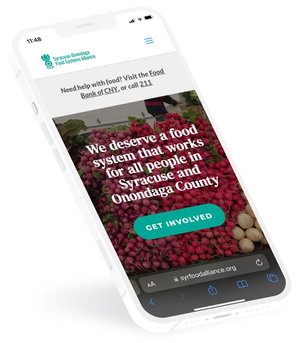
We started by designed a memorable new visual identity with a logo and color scheme. From there we dug into the messaging to understand the various audiences that SOFSA will be speaking to. We then built a website that clearly explains the valuable work that this organization does, and the impact it can have when the community rallies behind this cause.
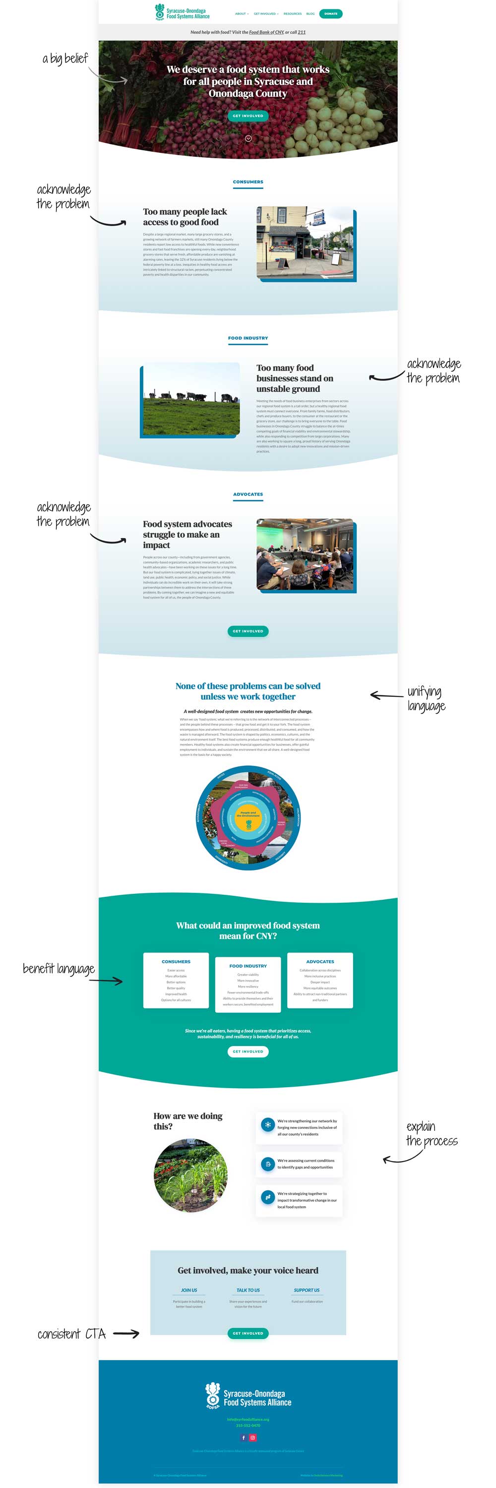
THE BUILDING BLOCKS OF COMPELLING MESSAGING
SOFSA HOME PAGE


“SOFSA was struggling to position itself publicly and convey it’s value, and our descriptive language was highly technical and jargon-y. Damian designed a new logo and website for us to communicate effectively to our various audiences. SOFSA’s membership grew by over 20% in the first six weeks after the website’s launch, and we’re now much better equipped to speak with our various audiences about the work we do and why it matters.”

Maura Ackerman
Director, SOFSA
